In part 5 of my “Making Apple TV Apps” series, we begin looking at things that are new to tvOS. The first item we’re focusing attention on is the slick looking 3D images we see when an app icon or other visual asset receives focus. See what I did there?
Keeping Things in Perspective
![]() Leave it to Apple to put a new twist on an old skool computer graphics technique and create a fresh, attention-grabbing effect. The use of parallax imagery in computer graphics was first popularized in arcade and home video games back in the late ’80s and early ’90s. Parallax is defined as “a displacement or difference in the apparent position of an object viewed along two different lines of sight, and is measured by the angle or semi-angle of inclination between those two lines.”
Leave it to Apple to put a new twist on an old skool computer graphics technique and create a fresh, attention-grabbing effect. The use of parallax imagery in computer graphics was first popularized in arcade and home video games back in the late ’80s and early ’90s. Parallax is defined as “a displacement or difference in the apparent position of an object viewed along two different lines of sight, and is measured by the angle or semi-angle of inclination between those two lines.”
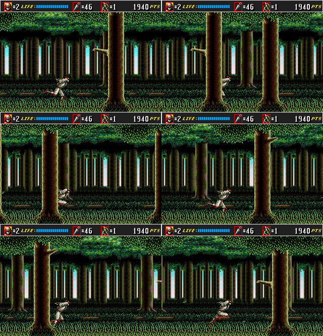
In layman’s terms, flat 2D images are displayed on top of one another as transparent layers. Layers that are supposed to be closer to the viewer move faster than those that are supposed to be in the distance when the images are panned from one direction to another. Of course, a picture is worth 1,000 words as they say, so here’s a great example from a 90s home video game:

Everything Old is New Again

Apple’s new variant of this classic effect combines the parallax panning of transparent layers with a 3D transformation of the final composite image, a dynamic drop shadow and a lighting effect that suggests a spotlight is bouncing off the image’s surface. These combined effects produce an end result that totally sells the illusion of a real object floating in front of us. But again, a visual example illustrates this more easily than words ever could. See for yourself below.
Making the Magic Happen

Apple provides three different ways to create parallax images:
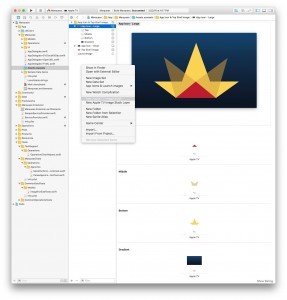
- Open your project’s asset catalog in Xcode and select the “New Apple TV Image Stack” command from the context menu
- Download and use the “Parallax Previewer” Mac OS X app from Apple’s developer site
- Download and use the “Parallax Exporter” Photoshop plugin from Apple’s developer site
Apple requires your application icon to be a parallax image. They also recommend that you make parallax images for use with any on-screen asset that can receive focus, but they don’t go so far as requiring you to do so.
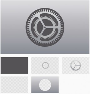
Apple parallax images contain 1 opaque background layer and up to 4 transparent layers. The background layer must be opaque; an error will occur when the parallax image is assembled if alpha transparency is detected in this layer.
Apple also recommends a visual “safe zone” for critical elements in your layers such as text content. This is needed due to the image edges being cropped during focus and parallax. See the Apple TV Human Interface Guidelines for details.
Until Next Time…
That does it for Apple TV parallax images. In the next part of this series, we’ll explore the Apple TV’s Top Shelf area and how we can populate it with dynamic content. I hope you’ll continue to visit or sign up for new articles to be sent to your inbox as soon as they’re available. Happy coding!
Leave a Reply