![]() After completing my cross-platform mobile developer recertification at Xamarin University this past spring, I wanted to give back to the community by creating my first open-source project and NuGet package.
After completing my cross-platform mobile developer recertification at Xamarin University this past spring, I wanted to give back to the community by creating my first open-source project and NuGet package.
For my open source project, I wanted to come up with something that would:
- Be useful for as many Xamarin-based projects as possible
- Have room to grow with more enhancements in the future
- Be something that I can freely share without any limitations
Looking for Inspiration
While looking around for ideas, I noticed a number of questions on Stack Overflow and in the Xamarin forums regarding how to apply basic styling to Xamarin.Forms components, like a background color for table/list view cells, or gradient fills for content pages. Xamarin.Forms doesn’t provide these properties by default, so the typical answer was “you’ll have to write your own custom XF component and renderer or effect if you want to do that.”
I also watched conference session videos and read blog posts to see what others were doing with Xamarin. One blog post in particular, Lighting Up Native Platform Features In Xamarin Forms, gave me the project idea and starting point that I was looking for. The post explained the concept of the BindableObject class’s attached properties mechanism. An example of the standard Xamarin.Forms Cell classes being enhanced by using attached properties was also provided.
Getting Attached
If you’ve worked with Xamarin before, chances are good that you’ve already seen attached properties at work. Take a look at the following Xaml declaration:
    <Grid>
        <Grid.RowDefinitions>
            <RowDefinition Height="*" />
            <RowDefinition Height="*" />
        </Grid.RowDefinitions>
        <Grid.ColumnDefinitions>
            <ColumnDefinition Width="*" />
            <ColumnDefinition Width="*" />
        </Grid.ColumnDefinitions>
        <Label Text="Top Left" Grid.Row="0" Grid.Column="0" />
        <Label Text="Top Right" Grid.Row="0" Grid.Column="1" />
        <Label Text="Bottom Left" Grid.Row="1" Grid.Column="0" />
        <Label Text="Bottom Right" Grid.Row="1" Grid.Column="1" />
    </Grid>
Do you see those Grid.Row and Grid.Column parameters in the Label tags toward the bottom of the Xaml declarations? You won’t find any mention of them if you review the Xamarin.Forms Label class’s API documentation. Those parameters are actually the most common example of attached properties at work in the Xamarin.Forms framework.
Attached properties appear to be part of the class they’re being applied to, especially if you’re declaring them in a Xaml declaration. However, they can be implemented completely outside of the target class they’re being assigned to. No code changes to the target class are required. This technique opens the door to adding new properties to the Xamarin.Forms control classes without modifying any of the XF source code.
Introducing XFGloss
It was clear to me that many of those commonly requested missing properties could be added by using attached properties. I took the proverbial ball and ran with it to add several new styling properties to the standard classes. The result is XFGloss, a drop-in UI styling enhancement for your Xamarin.Forms projects.
XFGloss in Action
Adding a XFGloss enhancement to a stock XF control is just as easy as the previously demonstrated Grid properties. You’ll still create your UI in your PCL or shared code project, applying the new XFGloss properties along the way as needed. The only platform-specific integration needed is calling the XFGloss Init methods, just as you already do with the Xamarin.Forms Init methods.
Here’s an example of XFGloss being used to specify a background color for a cell in a Xaml declaration:
<TextCell Text="Red" TextColor="White" xfg:CellGloss.BackgroundColor="Red" />
Setting the same XFGloss property in C# code requires just a bit more effort:
    var cell = new TextCell
    {
        Text = "Red",
        TextColor = "White"
    };
    CellGloss.SetBackgroundColor(cell, Color.Red);
If you need to set multiple XFGloss properties on a single XF control instance in code, its easier (and more like the Xaml syntax) to create a gloss instance and assign values to its properties, like this:
    var switchCtrl = new Switch();
    var gloss = new SwitchGloss(switchCtrl);
    gloss.TintColor = Color.Red;
    gloss.ThumbTintColor = Color.Maroon;
    gloss.OnTintColor = Color.Green;
    gloss.ThumbOnTintColor = Color.Lime;
The gloss instance calls the Switch control’s static getters and setters behind the scenes, so its okay for it to go out of scope and be released from memory once you’ve finished assigning all the needed property values.
Now Showing On Your Android and iOS Devices
All the new XFGloss properties are supported on both the Android and iOS platforms, with the exception of the AccessoryType property, which addresses an iOS-specific UI element. PRs that add support for any of the other XF-supported platforms are both appreciated and welcomed!
On the Android platform, the XFGloss properties have been tested on Android APIs from version 16 (Jellybean) through 23 (Marshmallow). APIs prior to 23 require the Android AppCompat library, which is already implemented for you when you create a new Xamarin.Forms project. The enhancements will fail gracefully on those older APIs if the AppCompat library isn’t being used.
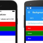
I’ve provided a gallery containing screen shots of the new properties in action below. You can also review code examples, instructions on integrating the NuGet package with your own project, a complete sample app, and more, in the project’s GitHub repo.
I hope you find my first outing in the open source and NuGet worlds to be useful!

